|
Basic Assignments
|
Options & Settings
|
Main Time Information
|
||||||||||||||||||||||||||||
|
|
|
|
|
|||
|
|||
|
|
|
Notes:
|
|
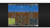
Steve and some of the other guys were on a bigger demo this morning. It was just Danny, Sean, John, Michael, and I on the meeting. The guys were talking about demos and what they like to show and what they like to gloss over (speed of the demos and interest levels). Sean then showed some of the cultivation stuff that they are setting up for an upcoming demo. It turned into a small sales meeting. Michael reported on what he was doing and up to. Sean and Danny were running the meeting. We went back and talked more about different bids, demos, and possible options. John showed us some of the dashboard stuff that he was working on for his school projects. We would love to grab some of that type of code and put some fun stuff into play inside of adilas. This deals with dashboards, quick counts, sums, totals, aggregates, charts, graphs, and other quick eye candy. We talked briefly about our desire to build out graphical homepages for each of the main players and sections. That would be really cool. As we were talking about graphics, Danny, who is a pilot showed a screenshot of a modern navigation or heads-up panel from an airplane. The old was way was tons of different gages, the new way is a real time visual with all of the main important stuff, right at your fingertips. That's what adilas needs, a head-up panel for your business. Danny then showed us a small video that he was working on. It's just a quick website overview. He is just playing with ideas, timing, and concepts. Anyways, here's the link to the video. Our next major subject was talking about display and modern design stuff. We went over tabs, horizontal nav systems, vertical nav systems, cards, titles, buttons, sliding drawers, show/hide and toggle options. Lots of visuals. That lead us into a discussion on my cart favorite buttons and how we could keep pushing on those custom buttons and improve their look and feel as well as add additional functionality to them. We talked about smaller cards with other required settings on the individual cards. We also talked about time buttons and how that could really help for scheduling. Great idea going forward for internal scheduling and fracture level controls for custom interfaces. To expand on the button concept and/or my cart favorites. What if the custom buttons weren't just for the cart? We have similar things on the snow owl theme and the individual payee buttons that can be mapped to different pages, URL's, reports, or sections within the site. What if we took all of those things (cart buttons, quick look-ups, jump or hyperlinks (URL's), navigation, and other options and made the whole interface something that you could setup, on the fly and be specific per user. As a side note, we allow for buttons to be copied right now, if they are set to public vs private. If a public button (aka some sort of nav type button) could be copied, that could be really cool and could allow a lesser user (skill wise) to be able to get awesome functionality without having to know the whole backend processes. Just a thought. This conversation took us over to the shopping cart, split cart, and different cart types and styles. We talked about all kinds of visual and setting based improvements that we could do over in the shopping cart land. We briefly rolled through the classic cart, the kush cart, and the short and sweet cart (different existing cart styles). John was talking about adding in settings to help with flow controls (step 1 of 3) or crumb trails (you are here - in this process or step), etc. Ways of visually showing our users where they are and what else if still coming and/or needed to complete a certain process or procedure. My biggest takeaway from the entire meeting was - "Show people, don't just tell them!". |