|
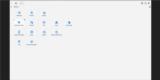
Basic Assignments
|
Options & Settings
|
Main Time Information
|
||||||||||||||||||||||||||||
|
|
|
|
|
|||||||||||||||
|
Photo/Image Count: 13
|
|||||||||||||||
|
|||||||||||||||
|
|
|
Notes:
|
|
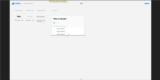
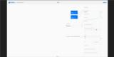
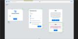
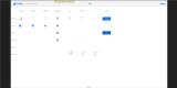
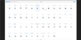
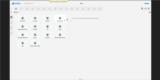
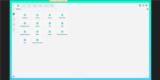
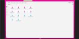
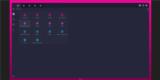
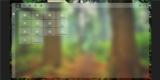
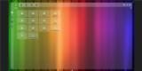
Met with Jonathan and went over our own version of a spec list. What is needed? We talked about his latest video walk through and the impact that it is having on different key adilas players. Good stuff and fun to see the reactions. Lots of positive feedback. Here is a link to the video from a couple of days ago - https://adobe.ly/2PEhYI4 Below are some new notes from our meeting today. - The value of the page and what is really important? Focusing on the task at hand. Sometimes we can get distracted by the tiny details. - Spec sheets - what does that mean and what are we really looking for? Sometimes that spec sheet develops over time through meetings, feedback, and decisions. Currently, we are somewhat in the mode of just in time spec sheets vs big long lists that have been prepped and formatted. We may lose some efficiencies but we gain in a real way by talking about real ideas and subjects. Not everybody likes it this way. - Timing and what is needed and when. Timing is huge. - Talking about adding colors and backgrounds. See attached for a few screen samples with some background colors and background images. Just playing around. - Meet, change, meet, change - R&D format (research and development) - This is somewhat how we are managing the projects right now. - Delightful (key word) - We want it to look good and be fun to work with (delightful). - Global nav searches and pushing that further (new quick search option). This could be huge. Being able to search the app for anything that matches a few specific key words. We could show navigation, buttons, links, help files, videos, tutorials, tours, tips, etc. Fun options to think about. - We spent a little bit of time talking about what the "education mode" means and what and how that would look like. We decided that if we turned it on, it would show all kinds of helpful info and tips to help orient a user. If they want, they could turn it off and the tips and hits would go away. They could turn it on/off as often as needed (the help options would change based on where they were in the app). - Making custom software easy - that's what we are trying to do. - Sent Jonathan a link to some research on fracture - https://data0.adilas.biz/top_secret/developers_notebook_home.cfm?q=fracture&sort=asc - as a note, fracture is somewhat of our code name for some of the ideas of where we want to go (future project). Things keep breaking and sub dividing (fracturing) right underneath us. We are trying to embrace the changes and roll with the changing landscape. - Going forward, we are planning more screenshots with more customizable options, real data layouts (fake data but simulating real pages), being able to drag and drop to help with sorting, and building up to CSS style guide stuff. As we go further, we may end up adding graphs, charts, and other eye candy type stuff. Just trying to fill out the navigational app with mock-up data. |