Basic Assignments
 
Options & Settings
 
Main Time Information
Color Code: Yellow
Assigned To: Brandon Moore
Created By: Brandon Moore
Created Date/Time: 11/19/2019 12:12 pm
 
Action Status: Blank (new)
Show On The Web: Yes - (public)
Priority: 0
 
Time Id: 5221
Template/Type: Brandon Time
Title/Caption: Meeting with Jonathan
Start Date/Time: 11/21/2019 2:00 pm
End Date/Time: 11/21/2019 3:00 pm
Main Status: Active

Photo/Image Count: 24
click to enlarge - photo by: Brandon Moore - Main tile interface with everything closed. This page is fully configurable with colors, show/hide, and ability add additional options.
click to enlarge - photo by: Brandon Moore - Notice the small little side menu that popped out. This allows for other primary or homepage type navigation options.
click to enlarge - photo by: Brandon Moore - This is a homepage type navigation page with icons, add new, quick search options, and stackable subs. This is considered the category type navigation page.
click to enlarge - photo by: Brandon Moore - This is the interactive map homepage and navigation system. This is just another primary navigation option that is available.
click to enlarge - photo by: Brandon Moore - This is the core layout or core navigation homepage. The reason it is called the core layout is due to the original design was as if you were looking down on a core shot of a world. All of the pieces were divided into pie shaped areas.
click to enlarge - photo by: Brandon Moore - Each of the navigation homepage will have options to control what is shown/hidden on the page. This side menu shows the settings for this page. Clicked items mean they will show, non clicked items will be hidden, but still available.
click to enlarge - photo by: Brandon Moore - Similar to the image prior... this one shows more configuration options for the main tile homepage and interface. This one shows some of the options down towards the bottom of the scroll (pane on the right).
click to enlarge - photo by: Brandon Moore - More slide out options from the left. This allows for the side bar on the left to be configured as well. Everything has settings.
click to enlarge - photo by: Brandon Moore - If you choose to add a new navigation page, you get a choice as to how to set that up. These are showing some of the settings and possible layout options.
click to enlarge - photo by: Brandon Moore - More blank or preset navigation screens and options.
click to enlarge - photo by: Brandon Moore - More blank navigation options. These are preset formats that we could then add in custom navigation elements.
click to enlarge - photo by: Brandon Moore - Pulling in custom navigation and options through a menu and/or drop-downs. These are all of the main classic homepage navigation pieces.
click to enlarge - photo by: Brandon Moore - Screenshot of the reports homepage. This is more of an icon/category list of related reports and sub reports.
click to enlarge - photo by: Brandon Moore - Showing a side menu and some other options and branding.
click to enlarge - photo by: Brandon Moore - Screenshot showing a toggle switch for education mode on/off switch. If the toggle is turned on, there may be more verbiage and/or helpers to help educate the people.
click to enlarge - photo by: Brandon Moore - Small screenshot with an optional third tab and being able to use virtual web page tabs to help preload certain images.
click to enlarge - photo by: Brandon Moore - This is a screenshot of the customer homepage with a sub menu pulled up (slide in from the side). Lots of options.
click to enlarge - photo by: Brandon Moore - Looking at settings per icon and how to control the verbiage, button name, color, icon, and URL (web address).
click to enlarge - photo by: Brandon Moore - This one shows navigation settings with two new options that are new. They are pin tab (add this nav as another tab within the system) and auto load tab at login. Both of those would really help speed things up and make it more customizable. Cool ideas.
click to enlarge - photo by: Brandon Moore - Screenshot of being able to add a new (any of the 12 main application players) by clicking the little + (plus button) in the top right of the navigation.
click to enlarge - photo by: Brandon Moore - Concept of using the quick search to both search the data (normal or default mode) or be able to search navigation and/or topics inside of adilas. There is a switch at the top that allows it to be used for different things. Interesting idea.
click to enlarge - photo by: Brandon Moore - This is a screenshot of being able to search in the navigation panel for either a link, button, or a concept or key word such as discount or loyalty point or inventory. As a side note, we may want to flag some of those navigation pieces with hidden flags.
click to enlarge - photo by: Brandon Moore - The cart functionality would be similar to what it is now. That icon would be at the top right corner of the app at all times. Options to view, setup, create, clear, etc.
click to enlarge - photo by: Brandon Moore - Brief look at the reports tab and some of the options from there. There will be configurable and standard reports as well as pre-saved favorites. Help the user get what they want as quickly as possible.


Notes:

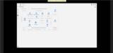
Met with Jonathan today about some of his layout ventures and site mapping and exploration stuff. We are making great progress. As a fun side note, in his demo today, he is hitting on almost everything that we have thrown at him via ideas and/or requests. I'm really impressed. And the best part... we are having fun along the way. Here are some notes from our meeting.

- We went over some of the things that Chuck (another designer) is working on and how that plays in.

https://data0.adilas.biz/top_secret/time_web_gallery.cfm?corp=748&id=5211 - sample screenshots from Chuck's sales work (presentation gallery)

- Jonathan then did a demo of his new layouts and I took 20+ screenshots. Super cool. I challenged him to create a virtual walkthrough video so that I could show it to other people. I'm super excited about that. Lots of refinement and making things more and more simple to handle and navigate.

- We talked about design systems or a system style guide - CSS - These are basically documents with visual elements and technical specs to help everybody on the team be on the same page. Helping to make the layout and look and feel all congeal and work together.

https://data0.adilas.biz/css/ - Small link to some of our existing CSS style sheets - This was a simple page that has a bunch of dummy data on the page. We will use some of these pieces to create the system style guides and design systems.

- After we get some of the styling fixed and lined out, we'll start going through the app and working on flow and processes. We will hit the most used sections first such as clock in/out, shopping cart, searching for items, invoices, quotes, etc.

- My goal - if we can sell what we have and keep it powerful, easy, and pretty. It is already very powerful. We need some loving on the easy and pretty part of that equation.

- Making it easy so that we can go to the masses. We want to open things up a bit. Along with this, we realize that some of our legacy clients may never switch, but all of the new clients will start out on the new features and hopefully enjoy and gain from those new developments and new design UI/UX (user interface and user experience stuff) and love the products. We will keep heading in that direction.