|
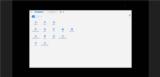
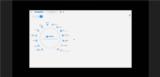
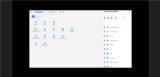
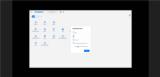
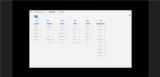
Basic Assignments
|
Options & Settings
|
Main Time Information
|
||||||||||||||||||||||||||||
|
|
|
|
|
||||||||||||
|
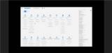
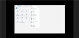
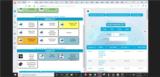
Photo/Image Count: 11
|
||||||||||||
|
||||||||||||
|
|
|
Notes:
|
|
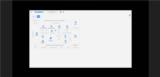
Jonathan, Steve, and I had a good meeting. We covered a bunch of topics. The notes below are what I pulled out of the conversation. Also, see attached for some new screenshots and concept art. - Giant group project - Steve, Brandon, and Jonathan all working together - mulitple inputs and ideas. - Jonathan really wants to create an edit "your page" type interface. - Lots of icons vs tons of text - simplify. - Fix some of the snow owl navigation to match the settings. This is true on the drop-down menus and possibly on the all_advanced_searches.cfm page. As a note, the snow owl menus have both on canvas and off canvas drop-down menus. - When the users are searching for categories and navigation options, maybe think about adding in some flags and tags to help find the nav links and pieces. For example: Say you have a page called advanced invoice search. It may be nice if it has flags such as inventory, POS, sales tracking, etc. Help the users find the related pieces. - Modals and small in-line pop-ups for settigns and drill-downs. - Lots of talk about custom homepages, pages that are not part of our normal design process or something custom or specific for a certain user. - Custom navigation options - simple, preset, build your own, help them find the sweet spot (not too many, not too few navigation tiles/buttons). - We talked quite a bit about the top bar icons (existing) and how many of the users really like those icons buttons. - What about things like help files, logout, switch corps, customer queue, shopping cart, chooser, saved favorites, my settings, etc. These are some of the existing top button links and icons. - We have so many clicks... wearing out the mouse pad or the buttons on the real mouse. Pretty deep and it takes a lot of clicking some times. - The user specific pallet and being able to condition little mini widgets - charts, aggregated page totals, counts, reports, buttons, froms, etc. - Blank canvas, setup your own tasks. - Being able to see preset numbers, values, totals, whatever. We will need to figure out what pieces are wanted and/or needed per section. We can figure that out. - Expanding and contracting things. This could be settings up sizes for mini windows and mini widgets - getting to just the information that you want. - Steve wants to be able to scroll both up and down. Basically setting an anchor point or starting point for scrolling. He would like to load things and be able to scroll up or down. - Lots of asynchronous loading. At a different time, we even talked about a thing called lazy loading (prepping behind the scenes). - Being able to have sub pages built into a bigger master page. Steve liked this idea. - Split screen, frames, and sub windows. Being able to remember different sizes and persets. - Seeing what pages are being used the most. That could really help us know where to focus. - Problems - load time is slow, too many clicks, want to get to info and may or may not want to go to the actual page. We almost need aggregated totals and being able to push and pull that data to different places. Quick totals or mini widgets - specific to a certain task. - What if we allowed for a multi split screen? - Going back to tools that you use - set up your own interface so that you have all of the tools that you need for the job - Example: Say a handyman with a trailer full of tools. He will grab what he needs for the current job. - Help people get to where they are going - analogy: All the tubes of paint on the right, just drag them out and setup your pallet. Hide the clutter and simplify things. When ready, start painting. - Everybody is going to be a little bit different, help them succeed. Let them pretend that they they are virtually "shopping" for or from a list of options. What do you want? That could be links, lists of options, functions, pages, or preset or known values or counts. All kinds of ways to get things setup - drag it out, click on it, activate it, choose from a list, use preset settings, and then start using it. Just ideas. - Custom dashboards, custom widgets with stored settings, lazy loading of pages in the background. - Some people like it, some people don't, but lots of our navigation is "go anywhere" type navigation... being able to jump as needed is a huge thing for us. We love it. - People get good in the system. Let them fly once they are at that point. - Two complaints - look and feel and too many clicks. - Ice berg(s) - there may be multiple pieces sticking up. - Keeping the cart icon as a valid nav piece at all times. |