Basic Assignments
 
Options & Settings
 
Main Time Information
Color Code: Yellow
Assigned To: Charles Swann
Created By: Charles Swann
Created Date/Time: 10/22/2019 2:31 pm
 
Action Status: Blank (new)
Show On The Web: Yes - (public)
Priority: 0
 
Time Id: 5085
Template/Type: Brandon Time
Title/Caption: Meeting with Chuck
Start Date/Time: 11/7/2019 1:00 pm
End Date/Time: 11/7/2019 2:15 pm
Main Status: Active

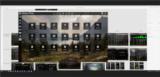
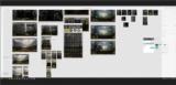
Photo/Image Count: 24
click to enlarge - photo by: Brandon Moore - A number of screenshots for the camp adilas project.
click to enlarge - photo by: Brandon Moore - The middle screenshot is a shot of the main dashboard and simple task screen.
click to enlarge - photo by: Brandon Moore - A look at the advanced reservation screen layout. This is for a single reservation. There is another screenshot for the multiple reservations screen.
click to enlarge - photo by: Brandon Moore - This is a screenshot of the multiple site reservations screen. It allows for multiple parties, multiple sites, and multiple payment options.
click to enlarge - photo by: Brandon Moore - This is a screenshot of the site page or area.
click to enlarge - photo by: Brandon Moore - This is a look at the waiting list within the site section.
click to enlarge - photo by: Brandon Moore - Screenshot of the map overlay with icons and details about each site. The icons help communicate lots of information without making the page too wordy.
click to enlarge - photo by: Brandon Moore - Screenshot of the customer management area. You could search, filter, drill-down, check payment status, etc.
click to enlarge - photo by: Brandon Moore - A look at the revenue (sales) screen. Filter options across the top, bar graph to help show numbers, and detail results below the graph.
click to enlarge - photo by: Brandon Moore - Similar to the revenue screenshots, this is for expenses and monies going out. There are filters at the top, a bar graph to show numbers, and details on the bottom.
click to enlarge - photo by: Brandon Moore - This is a reports homepage or reports sub section. This screenshot has a number of simple tiles with an icon, a title, a small description, and a button. Pretty simple.
click to enlarge - photo by: Brandon Moore - Sample report layout. This is what some of the reports might look like once they were asked to show-up and/or run.
click to enlarge - photo by: Brandon Moore - This is a screenshot of a settings page, where the user could setup some of their defaults and preferences.
click to enlarge - photo by: Brandon Moore - This is a small screenshot of what a settings dialog box may look like.
click to enlarge - photo by: Brandon Moore - Screenshot of how the map overlay system could work and/or be setup. The concept here is import an image, then use tools, icons, and drawings to help with the overlay and details. As a side note, we may need to help out the clients with this section.
click to enlarge - photo by: Brandon Moore - The background shows both normal images and some mobile mock-ups. In the middle, you will see a simple calendar interface that could be the main overview page in the mobile version.
click to enlarge - photo by: Brandon Moore - See the center image for a mock-up of the reservation search screen for mobile.
click to enlarge - photo by: Brandon Moore - See the middle screenshot for a check in/out and basic customer info screen. This is another mobile design layout.
click to enlarge - photo by: Brandon Moore - The screenshot in the middle shows a basic menu for what is offered in the mobile version of the camp adilas app.
click to enlarge - photo by: Brandon Moore - This is a mobile version of the site pages. You could click on a site to get more info. You could even reserve it right from this screen (start the process).
click to enlarge - photo by: Brandon Moore - Looking at a printer friendly invoice layout. Just a mock-up and concept art.
click to enlarge - photo by: Brandon Moore - Screenshot of an invoice inside the system. Then if you want, you could printout a simple printer friendly version.
click to enlarge - photo by: Brandon Moore - This was a discussion about black on black fields or black with lighter colored fields. We thought that black with lighter colored fields shows up better.
click to enlarge - photo by: Brandon Moore - Screenshot with both full screen views and mobile views of the same pages. All part of the design layout process.


Notes:

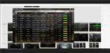
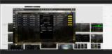
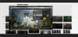
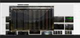
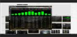
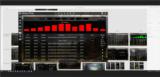
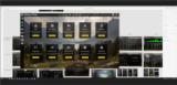
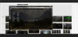
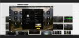
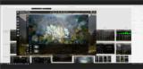
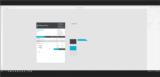
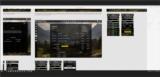
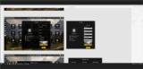
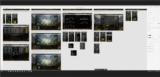
Steve and I met with Chuck. We started out talking about a prior demo that Chuck and I did. We then rolled into an update on the camp adilas project. Here are some of our notes:

- On the demo that I did, I opened it up too much and it ended up going all over the place. Not very focused.

- Create canned versions of what we can do and how we answer some of their needs. Almost the elevator type pitch (30 second or 2 minute overview).

- Maybe a concept map (like a site map)

- What can we do?
>> - Say something like - point of sale... walk through the steps
>> - Say taxes... walk through the steps

- Idea - create a simple web page and show some sort of nested titles (see Chuck's report page for his camping site and then be able to nest sub sections under those tiles).

- Protoype in Adobe XD for now, then maybe switch to WordPress or some other thing.

- Have Brandon create a list or outline and then have Chuck help put things together.

- From Steve - grateful for Chuck being able to bridge the gap between the look and feel and the sales side.
>> - Helping to get into the marketing groove.

- Start building out some specialized industry flyers. We need a general one and then some that are specific to industries that we cater to.
>> - Icons and helping to drill-down into the deeper specifics

- Chuck would like to see - testimonials and customer endorsements, backing, recommendations, and validation.

- How are we going about our building process? From the look (look and feel) down to the code vs code up to look (what is our approach?).

- Getting some of us out in the field really helps build and refine the system. As we sit through training and demos, we will have ideas and see things that need to be cleaned-up. Great use of time and resources.

- Reduce the learning curve - that will help get people more into the product.

- Being able to link out to specific screenshots as part of a presentation and/or demo.

- The power of the quick search inside of adilas - go anywhere - that is awesome.

- Any choice that the user has to make (over and over again), usually makes a good settings.

- Designing both levels normal web (desktop/computer) and mobile (responsive).

See attached for a number of new screenshots from the camp adilas or campground interface project.