|
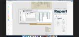
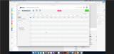
Basic Assignments
|
Options & Settings
|
Main Time Information
|
||||||||||||||||||||||||||||
|
|
|
|
|
||||||||||||
|
Photo/Image Count: 11
|
||||||||||||
|
||||||||||||
|
|
|
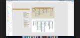
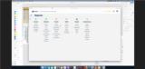
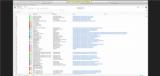
Notes:
|
|
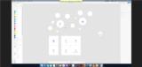
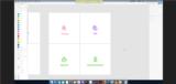
- Light overview of our vision - overarching adilas design vs individual business vertical designs and mini white label options. - Talking about the reports homepage... where can we go from there? Currently, there are reports for invoices, sales by, items, parent/child items, vendor stuff, and customer based reports. Jonathan was wondering about all of the other reports. In a way, all that adilas is a giant reporting application. Data comes in, then our users want to pull that data back in some way. That would be super awesome. - Going to some graphics and screenshots - Comparing old and new report settings and pages. One was on an older code set, new code sets, and even permissions and settings. Jonathan was noticing small differences based off of those vars (old, new, permissions, and settings). Lots of moving pieces. - What to expect... We talked about how the adilas core graphic was divided into main system players, then sub homepage based on that player group, each player group also had searches, reports, and other data or group specific output. Each section (main player group) will also have tons and tons of data associated with them. - The interactive map has a button for history and reports up in the top right hand corner. That is a pivotal piece (corner piece). - What do we do? We store data, we show data, etc. - Jonathan was listing out pages and then sorting them based on names, pages, sections, etc. - So much redundancy (in the design and in the navigation) ... new users can get lost. Does this button mean the same thing that I already saw or is this a different section? Because there are so many ways around the horn... it somewhat makes it hard to find your way around. - The shed and tool box analogy - You will need a lot of different tools. Most of them you keep in the shed and/or toolbox. However, each time you do a task, you want certain tools for the task at hand. How can we help them get to the tools that they need and still keep it super simple. A similar analogy is an artist and a pallet of paints. They need them all but they only are usually dealing with certain ones per painting. - The deeper we get, the more we get the comments... How can I go faster? How can I do more? How can I see more? How can I mix this and that? How can I (fill in the blank)? - Jonathan asked... Do you think people use your system more for viewing data or for entering data? We answered, both. It totally depends on which side of the fence you are on. Are you a salesperson at the counter do a sale or are you a manager looking at financial? It all depends. - We lightly talked about custom links, custom buttons, and custom icon navigation. - Some of the upper management users are wanting things quicker, faster, easier - things are going to mobile apps, quick reports, dashboards, etc. - Screenshots of searches on the sides, data is in the middle, and add new is at the top. Simple layout and then keep it standard on all group level areas (customer, deposits, invoices, PO's, expense/receipts, parts/items, stock/units, vendors, users, etc.) See the screen shots. - Being able to use settings (using the gear icon) to get rid of certain columns, sort values, pre-set setttings, page level settings, users settings, group settings, show/hide columns, custom naming conventions, etc. Super cool fracture type ideas and tech. This would be awesome for the upcoming fracture type system. - Standard of here is how you enter data, here is how you view your data, here is how you get to certain areas quickly. - A lot of the system is built out in tons of standalone URL or pages. That allows us to jump and interact with whatever page/tool that we want. As a technical side note, some of the pages do have required flow and pages but some of that is negotiable and/or programable. - Jumping back to the mind map type overview. We also talked about the interactive map and how we could use it to drill-down into more details from there. Being able to flip flop the view. Allowing for multiple different views of the same things (what is your style). - Being able to flip into an education mode and then be able to show simple videos, walk around tours, and step-by-step directions. This could show/hide extra verbiage, show/hide quick images, show/hide quick video tours, etc. Education is a huge key. - We are seeing that every page is going to need an id number for saving settings on a per page level. This is feature already exists. We just need some data entry to get all of the id numbers. Jonathan would even love to store possible CSS settings and such on a per page level. Lots of roads leading in this direction, page level controls and settings. - See attached for image uploads of concept art, icon boxes, magic 4 square, search and results options, mind maps, etc. |