|
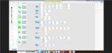
Basic Assignments
|
Options & Settings
|
Main Time Information
|
||||||||||||||||||||||||||||
|
|
|
|
|
|||||||||||||||
|
Photo/Image Count: 14
|
|||||||||||||||
|
|||||||||||||||
|
|
|
Notes:
|
|
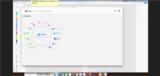
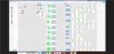
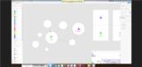
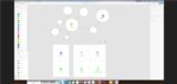
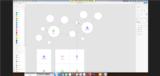
Steve and I met with Jonathan Wells to go over some progress. Below are some notes from our call. - Creating user stories - basically scenarios and simulations - help to visually lead a user through the system and even know what is possible and how to do it. - Question about obscure features vs basic or super needed functions and features - those extra or obscure tools and features create an expense (extra burden) to other customers (it makes it a little bit harder) - We need to narrow things down a bit. - Settings - 4 main levels - world, group, page, user - Templates per industry - basically, a way of controlling bulk settings per industry - Cause and effect relationships - the deeper you go, the more you get into cause and effect relationships. - Helping customers succeed - eventually you may need all of the different business tools and/or features and/or modules - there is nothing wrong with having the tools, you just may want to keep some of them in the shed until you need them. Only use or keep out what you will need. - Each company may need to pick and choose what tools they want and how they want to play - It also gets into size of the company. Even though they are the same type of company, the bigger they are, they need more tools and options. It gets deep fast. - Features, advantages, benefits - great way to think about things and options. - How do we get the word out and let out clients know about some of the new changes? Even then, do they read the news and updates? - It comes back to the adilas café type model and having a place to show your stuff, work, play, train, be part of the community, etc. - Classic vs snow owl - what does that mean? It actually deals with a set of standard look and feel templates, headers, footers, and display options (visual themes). - Map overview - Jonathan started showing us some of his new menu and nav systems - See the attached screen shots to get some ideas of where he is headed and some of the mapping concepts, mock-ups, layout options, and direction. - Stacking the view and the nav - getting into graphical homepage and sub homepage and sub navigation. We didn't get super deep into this, but there is tons of potential there. Have a very easy to navigate frontend. As you get deeper, you still have a very friendly and visual navigation page at the sub homepage or graphical homepage level. Don't be confused by the word homepage. Each sub section inside system would need it's own sub or graphical homepage. For example: Say you have a main overview map or nav page. You would then also need a sub graphical overview page for say customer homepage, invoice homepage, time homepage, user homepage, PO homepage, deposits homepage, flex grid homepage, media/content homepage, etc. Hopefully that makes sense. See attached for some mock-up graphics and ideas including flat maps, icons, icon lists, mind maps, and related pieces. You could even virtually zoom in/out as needed to get more detailed views. - What about a simple search (by typing) type interface? Be able to search for things like gift cards, payroll, inventory, discounts, etc. Once the search is completed, it shows options. This is kinda like a google type approach to the system. They, Google, tried to simplify the whole Internet. We could do something similar to that inside of adilas. Just another option. - Google map view - zooming in and out - to expose different levels - mind maps (see attached for some concept art for mind maps) - How visual education could really help them know what is involved and where things are going. - Ranking pages and sections and what is the most important. That would really help to find the common threads. Steve and Jonathan kept going with the meeting after I left. Steve told me later on, that he and Jonathan went for another hour (ish). They ended up on the reports homepage and Steve was going to have Jonathan give that page a small facelift. Good stuff. |