all data is live and searchable
|
Basic Assignments
|
Options & Settings
|
Main Time Information
|
||||||||||||||||||||||
|
|
|
|
|
|||||||||
|
|||||||||
|
|
|
Notes:
|
|
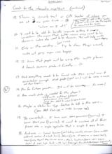
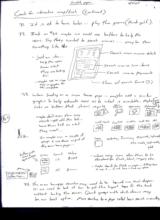
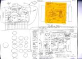
Spanning from December 23, 2010 – August 8, 2011 GOALS FOR THE INTERACTIVE MAP/TOUCH 1. Visual layout and virtual navigation tool (Color code permissions – very simple: -green means go, -red means no go or stop) 2. Not all items are physical. I may need to assign a room or area that can hold or maintain a concept. 3. I want to put like pieces together. Eventually, I want to use it to help teach flow and concepts (theory). 4. I want it very open (show all p9eces) yet limited as far as access. Permissions. 5. I want it to look appealing (simple yet classy). It needs to do lots of things but maybe some of the pieces will need to be a layer deeper than the surface – say a sub set or item sub set. 6. When I click a sub, lock all main buttons, show the subs (with permissions) and options. 7. I’m not worried about eh back button or holding a sub menu. However, it might be cool if we could pass things back and forth to help with “where am I” and sub of sub navigation. Say subs on the invoice homepage (reports, searches, new, etc.) or even subs on the actual invoice (main, edit, printable, history, verify). (Main map, top level nav, sub level nav. Map: main, sub, item) 8. I’m actually hoping that this flash app will help lower the overall system needs and bandwidth. I’m trying to simplify things not make them more complicated or harder to understand. I want it to be very logical and easy to learn. (Map Sketches: see photo gallery) Don’t worry about the outside shape until the end. “Things don’t have to be square” What about? - Maintenance - Favorites - Locations - Departments - Permissions - Other reports - Recipe/builds - Forms/paperwork - System basics - Quick search - Help videos - Tutorials - Photos & scans - Taxes & collected items - Corp-wide settings - eCommerce - Check requests - Quick search - Reoccurring invoices - Rentals, reservations, scheduling: (person, place or thing) – this is not done yet but would be very cool. This could help users see another component called time management. - Maybe put time and waiting room in the middle of the diagram. Maybe include some different rooms or levels. - Some additional items have been added in case we want to use the map as a navigation tool. 9. Show a crumb trail or GPS locator of where you are at any given times… “Where am I at?” (this might go right in the header or footer with vars like the help file for main, sub & item levels.) 10. I need to be able to handle corp-wide setting and naming conventions. This means that button names may need to be dynamic. Colors also need to be dynamic. This will help with consistency. 11. Easy on the reading… (less is more), try to show things visually without going super icon happy. 12. I know that people will be using this with phones and touch screens, make it friendly… 13. Not everything needs to be forced into this visual nav and orientation concept. Most people (right now) will be using a mouse not their fingers. 14. Plan for future growth… It will be coming… For sure! 15. How much data is needed for the player? o Date o Corp-wide settings (verbage) o Permissions – (only active) o Small item details and values (mapping to subs) o Colors 16. Maybe a status bar-type feature to talk to the users… (see ARA flash app or MDI homepage app) 17. Be consistent… I have over 100+ permissions (& growing), I have 500+ pages (& growing). I need to combine all of these pieces into a single application that is simple and easy to use. 18. Audience… casual browser (just looking around), Managers (using multiple & different sections at a high level), Admin (using all areas on a casual level), users (every day, all day, 50-100 times a day), hardcore/power users (every section at super high levels, with high frequency), Accountants/Bookkeepers (specialized usage). 19. We will need personal settings to help with how to show the main homepage. I would like to replace the current homepage with the map touch. However, I know some folks are very fast with the classic html version. Maybe have some options. o Classic only o Map only o Both w/map on top– maybe just these two o Both w/classic on top – maybe just these two o My favorite button links – this is a third option and is similar to the my cart favorites but for system navigation and page flow. 20. I’d like to use a building metaphor (rooms and doors and hallways). However the real application is more like a solar system with start clusters and orbits… (sphere) 21. Coming back to the audience… Most of our current users are 16-60 years old. I would love to get it to the level 10-80 years old. Make it super simple. We can always add more features later on if needed. Eventually I would like to get this in to schools and teach an upcoming generation… 22. Looking ahead… Most people are using desktop units and monitors or standard laptops. More and more people are going to smaller and smaller devices with more and more interactivity and “richness” (user interface). Where are we headed? 23. If I have all of the basics right in front of a user… this might be a great place to help educate and show how things interact… This could be right on top of the map and show audio and small presentations of flow, options, and theory… We really need this! 24. Every morning ask the user what they want to see. Then store that value in the session scope. Have a link to reset or change interface. o Interactive platform (Flash) o Classic web interface o My Quick buttons 25. On the pages that have multiple options or search forms, provide options to only show requested forms (virtual page filter). This would work great on advanced searches, payroll homepage, etc. 26. Be able to filter existing results. Basically, make the data very easy to get at and then allow specific forms to filter the data. 27. Maybe the choice for the different skins could be on the bottom of the page as small thumbnails. 28. We may need to add in order to simplify. Add page filters, new drill-down options, etc. Break pieces in to smaller bit size pieces. 29. On the ideas and sharing (button) section. Provide an idea center type interface along with updates, tips, and community. Maybe a small forum-type deal at some point. This is where we can help the users steer the ship. Allow for comments to be submitted (maybe not shown until approved). 30. Concepts, theory, basics, dreams… show small analogies, ideas, direction, vision. Business data sphere, 1-many, client server, relationships, flow, data mapping, etc. Cause and effect, different levels, permissions, history, future. 31. It is okay to have holes… play the game (think golf). 32. Back on #25 maybe we could use buttons to help the users. Say they wanted to search invoices… maybe show something like this: (see sketch in photo gallery) o Search main invoice details – Search invoice line items – Search invoice payments – Show all search forms (3) o Just an idea… help the users know what they are looking for. o Maybe use an image map or graphic for the navigation 33. When landing on a main homepage… maybe add a similar graphic to help educate uses as to what is available. Maybe links or buttons that show: Maybe don’t even show any records right off the bat… have them tell us what they want… Or maybe run a couple of groups and use those as part of the main home page o Buttons with icons & light verbage (maybe make the buttons longer…) o Reports o Basic search o Add new o Advanced search o Basic search o Last record o Last 25 o Last 50 o Last 100 o All o Today o Yesterday o Tomorrow o This week o Last week o This month o Last month o Ytd o When using icons allow them to be standard for flash, html, images, etc. o Maybe check for flash on pages… if they have it use it… if not, have a back-up option 34. The main homepage searches may need to be buried one level deeper. Or we need to look at how to get the biggest bang for the buck without hurting the server. Quick groups with drill-downs may be our best option. Move searches to a page called basic search or something. 35. Dreamweaver has an editor tool to help with image maps. 36. As of 6/9/11... the goal has switched to just show where we are going until we can get it all done. We have to buy some time to get the other pieces in to play. 37. Add a standalone homepage for every section (in the interactive map) this will help with favorite button links. 38. On the top of each page… add a visual crumb trail of, you are here… (map) (invoices, edit main) 39. The graphics may be simple if we could use a mini version of the page or section where we are headed to. Basically, instead of spending tons and tons of time developing hundreds of new icons, use the mini page version. It may add consistency without tons of extra work. Also put numbers out to the side to help with tech support. Then again it might get touch with dynamics and permissions. Maybe number everything and show a red light or green light for permissions. o Basic Search (green) o Advanced Search (green) o Add/Edit Sub Type (red) o Spacing – Quick & brief description 40. Related to the above idea… the graphic should be around 100X60(ish) and there should also be different help options. Quick help – getting started – step by step – more help. Not sure on wording but help to educate your users. 41. When showing sub menus and options… make sure and remember the custom code directory, the web services stuff, and other hidden tools that may be needed on a one-by-one basis. The reason for this note is these are some pages and tools that are hidden but still serve a purpose. We may need to increase the page count so that each section has a good landing spot (a sub home page or base). 42. What if we took the permissions to a graphical interface as well. That might make it more intuitive and easier to give and assign permissions. |